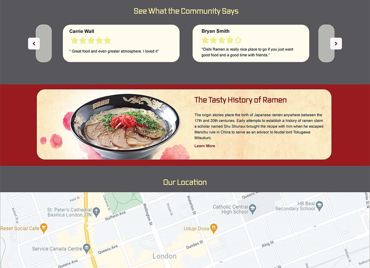
For this project I had to create a homepage for a ramen restaurant and then use that initial web layout to make mobile and tablet sized versions.
Final Work
Final Web Layout
Final Tablet Layout

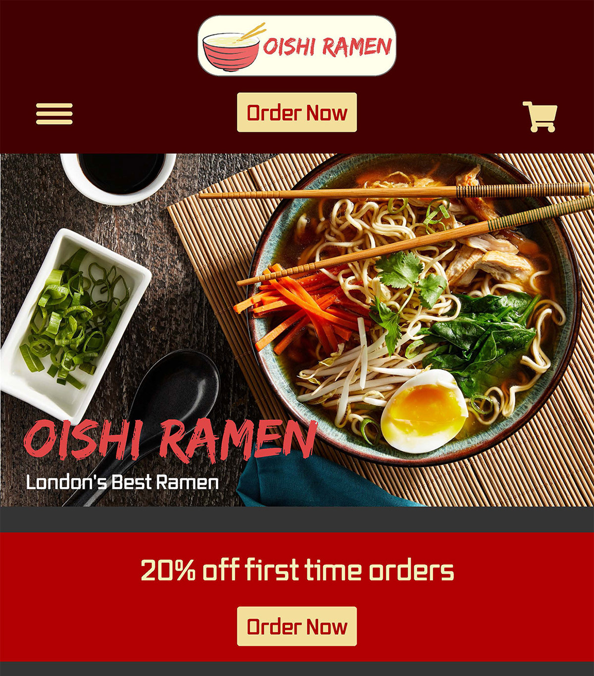
Final Mobile layout
My Process
To start off I created a wireframe to get the layout and general types of content I wanted into the website and how they would all work together. I also went and made a version with annotations so me and others could understand what the intention of each component.
Wirefram

Wireframe With Annotations
For the desktop version I took my ideas and general layout from the wireframe and reformatted some of them based off feedback and general look as I started inputting photos and text.

Desktop Header
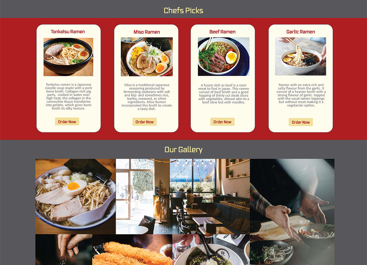
Cards on Desktop
Slider on Desktop
Desktop Format Aspects
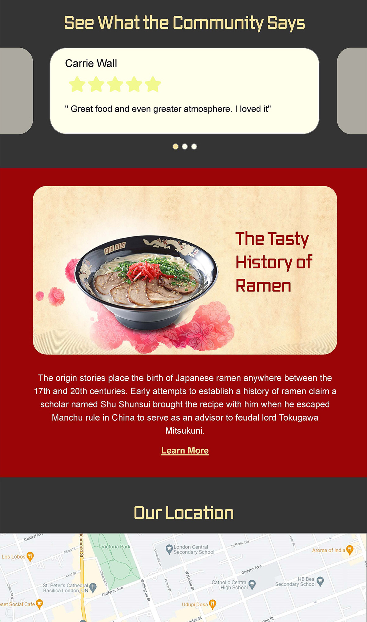
Moving on to the tablet format I took the desktop layout and took the aspects that would be affected most by the size and format change. For example, I reformatted the cards to a 2X2 grid in order to have them readable by the user. I also changed the grid format of the image gallery to that of a slider so that the images could easily show up. Some of the sizes of the images like the header and history of ramen image and I made them longer to make up for the shortened length from the new format.
Tablet Header
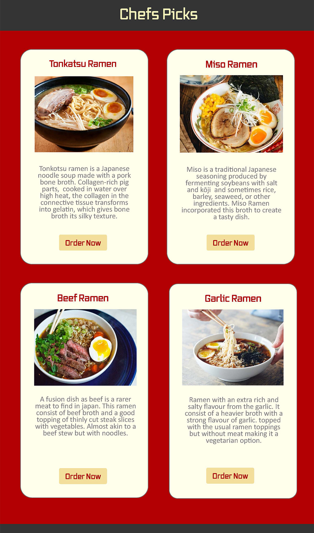
Tablet Cards
Tablet Slider
Tablet Format Aspects
Last I did the mobile format as it was an obvious follow up to the tablet size. Starting from the tablet size I then changed a few things like the cards I changed even further to have them in a single row to be readable and clickable as well. The other big thing I changed was the footer I reformatted all the information into vertical stacking so that all the information could be read and interacted with.
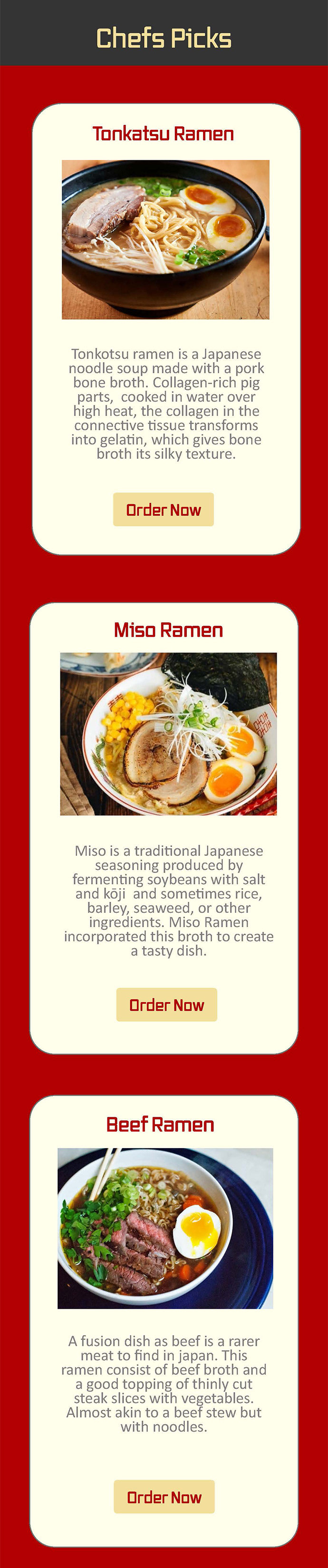
Mobile Cards

Mobile Slider and Footer
Mobile Format Aspects